It's that time of the week again! And wouldn't you know it, we still ain't got no significant updates for you (what can we say? We're moving at the speed of government right now, whether we like it or not). However, when we're not ranting about beer, there's quite a bit of doodling that goes on behind the scenes 'round these parts. We thought that you, our scholarly readers, would be interested in the decisions behind the bones (and mayhaps you'll take comfort in the fact that we do give our graphics a nonzero amount of thought).
As our three long-time readers will recall, BUBco has undergone a few face lifts over the last year. We had quite the time brainstorming all sorts of funky ways to visually express our original name: trying to come across as unique, handcrafted, genuine, and [insert meaningless marketing-speak here] as possible. The first version of our logo was well-liked, but after several hundred unsuccessful attempts to use it on something (anything), we realized it just wasn't up to snuff.
  |  |
Variations of the skull/mustache theme have been the only constant throughout the process - the original logo had more traditional detail to it, with cheekbones and teeth (you know, all that fun stuff that logos totally need). But after a couple months, we let it go for a simpler version (it was difficult to make out the details at a small scale, and that unintended leer kept us up at night).
After a brief return to the drawing board, the second (and mostly current) iteration of the logo surfaced. The skull got softened and cleaned up a bit and we made his face more expressive (no easy task since we pulled out all his teeth). We ditched the fancypants lettering and replaced it with some hop-and-grain crossbones under the skull, and voila! Our new logo was born!
After a brief return to the drawing board, the second (and mostly current) iteration of the logo surfaced. The skull got softened and cleaned up a bit and we made his face more expressive (no easy task since we pulled out all his teeth). We ditched the fancypants lettering and replaced it with some hop-and-grain crossbones under the skull, and voila! Our new logo was born!
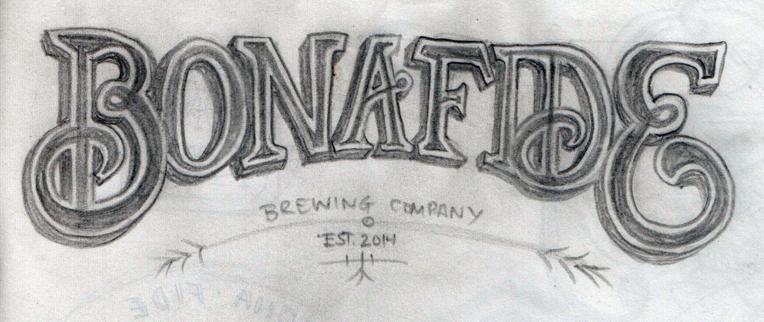
 Logo #1, Terror level: 5 out of 5  Logo #2, Clutter level: 3 out of 5 | 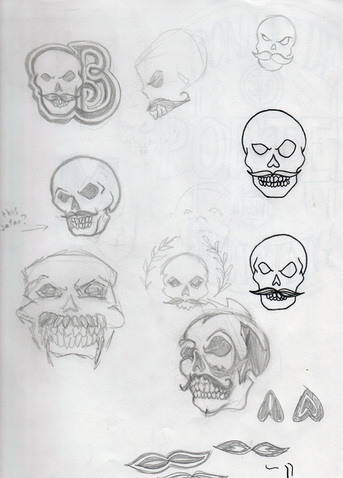 Original concept sketches, with the current logo added in last-minute to make it look like we had that idea all along. |
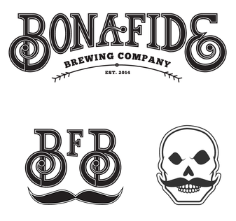
While we look back fondly at Version II, when we went through our name change and rebranding process a few months back, we dropped the crossbones for a less cluttered look (we obviously kept the dreamy, pensive eye sockets).

Horatio Skellingham III, Esq.
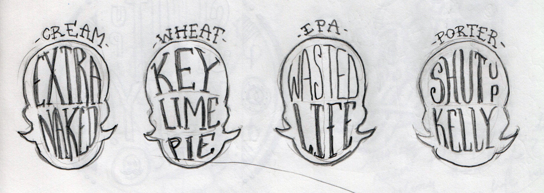
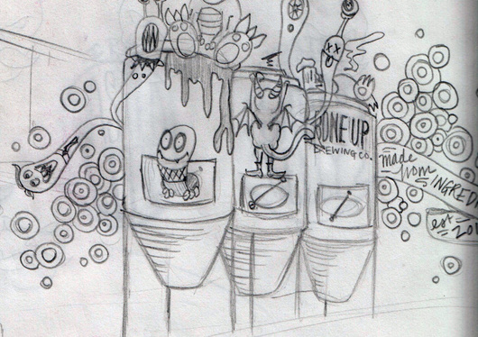
Bonus! Here's an glimpse into some beery doodles from Jimbo's oddball mind. Trust us, these will start to make a lot more sense once you see the cool stuff we're gonna draw all over our labels.
 Jimbo... might think fermentation is done by goblins? | 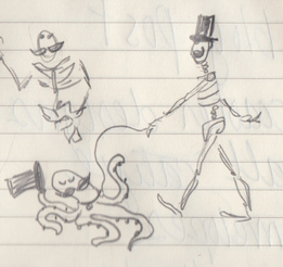 Horatio and El Pulpo out for a brisk constitutional |
 RSS Feed